The Secret Behind Color and Fabric Harmony in Fashion Design
Introduction
Fashion isn’t just what we wear — it’s how we feel.
Every outfit tells a silent story, and behind that story lies the magic of color and fabric harmony.
When colors and materials blend perfectly, something happens: the outfit breathes, moves, and speaks.
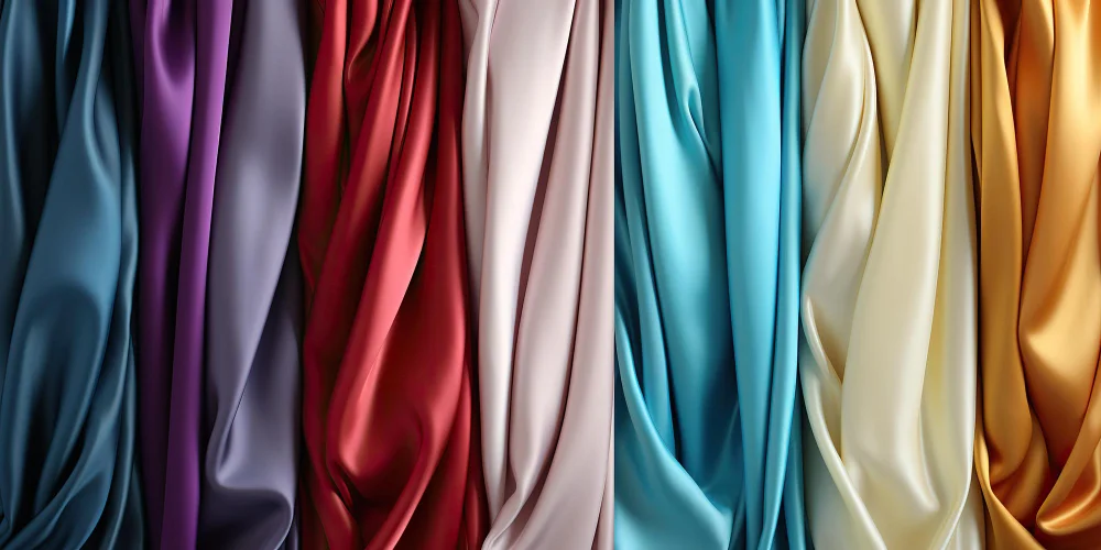
Think of the fluid grace of silk in soft pastels or the bold energy of velvet in deep jewel tones — every combination creates emotion.
Let’s uncover how designers use this timeless balance to shape beauty, confidence, and mood.
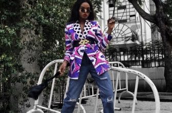
The Emotional Power of Color in Fashion
Color is emotion made visible.
It can energize, calm, empower, or even transform how others perceive you.
• Warm colors like red, orange, and gold project passion, joy, and vitality.
• Cool colors like blue, green, and silver suggest calm, depth, and trust.
• Neutral tones like beige, grey, and cream bring balance, simplicity, and elegance.
When combined thoughtfully with the right textures, these hues go beyond appearance — they become a feeling you can wear.
That’s the heart of fashion color psychology.
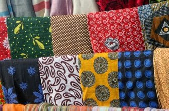
Fabric — The Soul Behind the Shade
If color is the emotion, fabric is the vessel that carries it.
The same color can look completely different on silk, cotton, or linen — because texture changes perception.
• Silk red feels romantic and luxurious.
• Cotton red looks cheerful and energetic.
• Velvet red exudes power and depth.
That’s why great designers spend hours testing how light interacts with materials before finalizing a collection.
It’s not just about matching colors with fabrics — it’s about making them speak the same language.
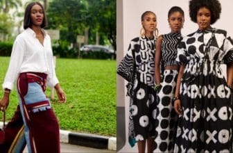
The Art of Creating Color and Fabric Harmony
To achieve harmony, designers use three timeless principles:
1. Balance: When one element shines (like a bold color), let the fabric stay calm.
2. Contrast: Pair light fabrics with deep hues, or heavy materials with soft colors, to create dynamic tension.
3. Mood Alignment: Match the emotional tone — for instance, bright chiffon for playfulness or muted wool for quiet strength.
These simple rules transform an outfit from good to unforgettable.
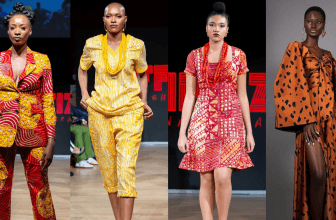
Cultural and Emotional Layers of Fabric and Color
Throughout history, color and texture carried meaning far beyond aesthetics.
In Africa, vibrant fabrics like Ankara or Kente symbolize unity and celebration.
In Japan, silk kimonos express season and spirit through subtle color gradations.
In the West, black velvet once represented nobility and mystery.
This global heritage proves one truth — fabric and color coordination connects art with identity.
It’s fashion’s oldest form of storytelling.
How to Create Your Own Harmony
You don’t need to be a designer to master harmony.
Here are three easy ways to make your wardrobe feel more intentional:
• Start with emotion: Ask, “How do I want to feel today?” and choose a color that reflects it.
• Let texture guide your tone: Flowing fabrics soften strong colors; structured fabrics sharpen them.
• Experiment in natural light: Always check how color appears on fabric under daylight — artificial light can trick the eye.
With time, you’ll start to feel when an outfit is “off” or perfectly aligned — that’s your intuition recognizing true harmony.
Conclusion
Fashion harmony isn’t about rules — it’s about rhythm.
When color and fabric move together, they create emotion you can see and confidence you can feel.
So next time you’re pairing colors or fabrics, think less about matching — and more about connection.
Because when your clothes feel balanced, you do too.