
Introduction
Every unforgettable outfit has one thing in common — contrast.
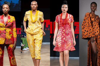
From the red carpets of Paris to the catwalks of Milan, fashion designers use the art of fabric contrast to command attention and tell a visual story.
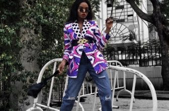
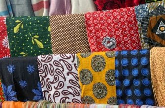
Contrast isn’t just about color — it’s about the way materials play off each other. It’s the shimmer of satin against matte wool, the edge of leather beside lace, or the boldness of denim softened by chiffon. When done right, contrast adds depth, drama, and luxury to even the simplest design.
Here’s how you can master it like the professionals.
1. Understand the Types of Fabric Contrast
There are three major kinds of contrast in fashion design:
• Textural Contrast — mixing rough with smooth (like tweed and silk).
• Weight Contrast — combining light with heavy (like chiffon and denim).
• Visual Contrast — pairing matte with shiny, or light colors with dark tones.
Great designers often use all three at once — a balance that keeps the eye moving and the look unforgettable.
2. Start with a Dominant Fabric
Every great design has a leader.
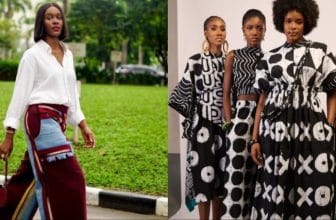
Choose one main fabric that sets the tone — it could be bold, patterned, or neutral. Then layer or accent it with a secondary fabric that contrasts in feel or tone.
For example:
• A soft linen dress with a structured leather belt.
• A glossy satin blouse paired with matte crepe trousers.
This balance between strength and softness creates instant sophistication.
3. Use Color and Texture to Shape the Silhouette
Texture has power. Shiny fabrics like silk and satin attract light — they highlight the body.
Matte fabrics, on the other hand, absorb light — they subtly hide or soften areas.
Designers use this intentionally to shape the silhouette: glossy for focus, matte for balance. It’s one of the oldest but smartest tricks in couture.
![]() Pro Tip: Use light fabrics to draw attention upward and heavier fabrics toward the bottom for visual stability.
Pro Tip: Use light fabrics to draw attention upward and heavier fabrics toward the bottom for visual stability.
4. Layer with Intention
When layering different fabrics, the goal isn’t chaos — it’s curated contrast.
Each layer should complement the other, not compete.
A sheer organza jacket over a cotton tank, or a wool blazer over a satin dress, creates visual dimension that photographs beautifully under natural or studio light.
In interior design and fashion alike, layers make the look feel rich, tactile, and three-dimensional.
5. Pay Attention to Movement
Fabric contrast is about motion, not just texture.
A flowing chiffon skirt paired with a structured leather jacket tells a story of strength and softness.
Designers often test how fabrics move together on mannequins — because when textures clash in stiffness or drape, the result feels awkward. Movement harmony is what separates amateurs from professionals.
6. Let Accessories Amplify the Drama
Accessories can heighten or balance contrast.
If your fabrics already speak loudly — like sequins and velvet — go for minimalist accessories.
But if your outfit is mostly smooth or neutral, use bold jewelry, textured handbags, or woven belts to add character.
Contrast isn’t always loud — sometimes it’s a whisper that completes the look.
Closing Thoughts
The art of fabric contrast lies in knowing when to push boundaries and when to pull back.
Every pairing you choose — soft with strong, shiny with matte, structured with fluid — creates emotion, story, and style.
At WeFabrics, we believe contrast is more than design — it’s identity. It’s what turns simple fabric into statement fashion.