How to Match Fabrics and Colors Like a Professional Designer
Introduction
Whether you’re designing clothes, decorating a space, or planning a custom piece for a client, knowing how to match fabrics and colors can make or break your project. The right combination creates harmony, mood, and style — while the wrong pairing can feel chaotic or dull. As someone who has worked with countless fabric swatches, I’ve seen how small color and texture choices completely transform the final result.
Here’s a step-by-step guide to help you confidently combine fabrics and colors like a professional designer.
1. Start With a Vision Board
Before picking up any fabric, create a quick mood board. Include photos, color swatches, or even textures you love. This helps you define the mood — elegant, minimal, cozy, or bold — and ensures every fabric and color fits the story you’re trying to tell.
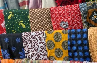
2. Understand Fabric Textures
Texture is the soul of a fabric. Mixing too many heavy or shiny textures can be overwhelming. Try this rule of thumb: combine opposites. Pair rough with smooth, matte with glossy, thick with light. For example, raw linen looks stunning beside soft silk or structured cotton next to sheer chiffon. It’s all about balance.
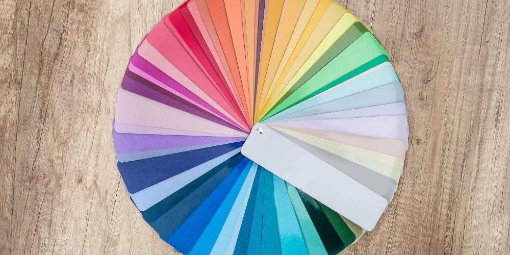
3. Use the Color Wheel as Your Secret Weapon
Designers rely on color theory for a reason.
• Complementary colors (like blue and orange) create bold contrast.
• Analogous colors (like yellow, orange, and red) bring harmony.
• Monochromatic colors (different shades of one color) feel sophisticated and calming.
When in doubt, use three colors max in one design. Too many hues can make your piece feel scattered.
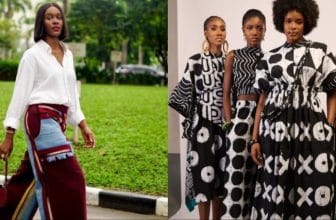
4. Match Prints with Solids
If you’re working with patterned fabrics — florals, stripes, or checks — balance them with solids. Let one print dominate and use the rest as accents. This technique keeps the design visually pleasing and ensures your main fabric stands out.
5. Consider Lighting and Environment
A color that looks perfect under indoor light may appear completely different outdoors. Always view fabrics in natural daylight before making your final choice. For interiors, consider how morning and evening light affect the mood of your space.
6. Test Before You Commit
Lay your selected fabrics together. Step back and view them from different angles. Touch them, fold them, and see how they behave side-by-side. Sometimes the combination that looked great in your head feels off in real life — and it’s better to adjust early.
7. Let Your Signature Style Lead
Trends come and go, but your unique eye is timeless. Once you understand the basics of matching fabrics and colors, don’t be afraid to break the rules. Experiment, mix cultures, and let your creativity speak. That’s what makes your designs unforgettable.
Closing Thoughts
Matching fabrics and colors isn’t about perfection — it’s about storytelling. Every shade and texture adds emotion and character to your creation. The more you practice, the more confident you’ll become in trusting your instinct.
Share your ideas in the comments — we love hearing from fellow creators around the world.
.