Introduction
Every color tells a story — and in fashion, that story begins long before the runway.
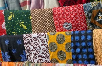
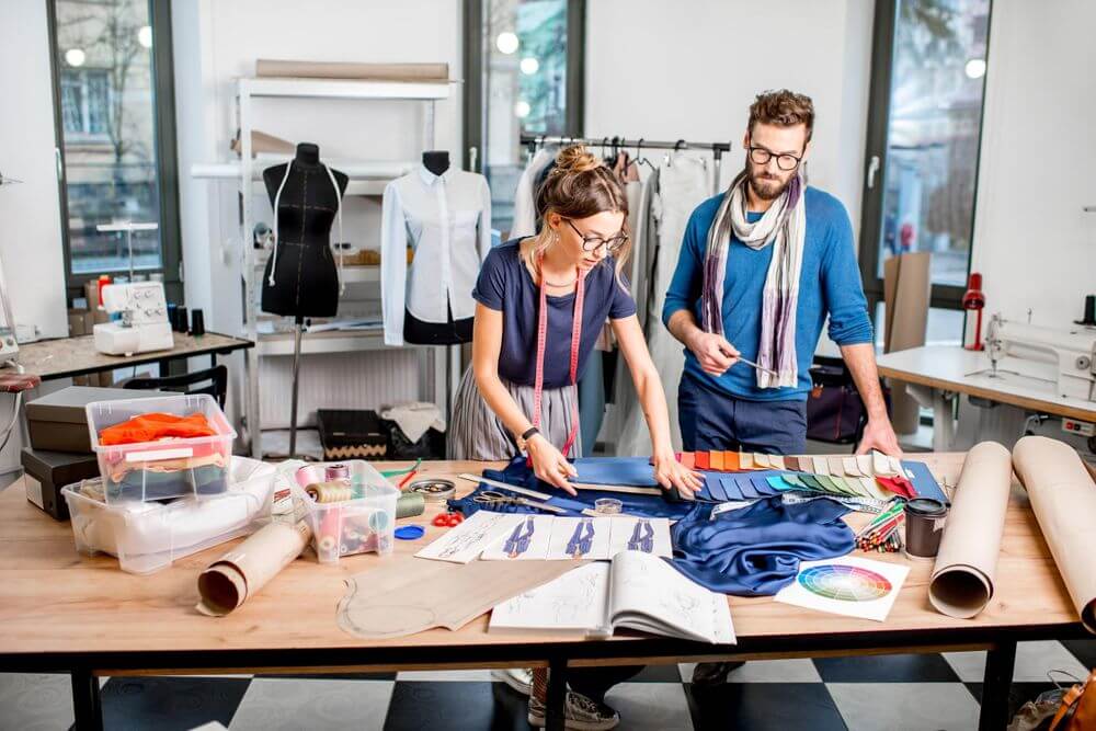
When designers choose fabrics, they’re not just picking shades that look pretty. They’re choosing emotions.
Color psychology helps designers understand how colors influence how people feel, think, and react. It’s the invisible language that turns a dress into a statement, a suit into power, and a scarf into calm.
Let’s explore how the world’s best designers use color psychology to select fabrics that speak directly to the heart.
1. The Power of Color in Fashion
Color is the first thing people notice.
Before the texture, fit, or price — our eyes register color.
Designers know this, and they use it deliberately. A deep red fabric can spark passion and confidence, while a soft blue cotton can calm and comfort.
Fabrics carry both physical texture and emotional texture — and color determines how that fabric feels before anyone touches it.
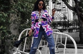
2. Red — The Color of Passion and Power
Red is bold, energetic, and impossible to ignore.
It’s often used in fashion to symbolize confidence, romance, and leadership.
Designers select red fabrics — silk, satin, or velvet — when they want to make a statement.
You’ll find red in evening wear, couture gowns, and power suits for a reason: it demands attention.
![]() Psychology Tip: Red stimulates the senses and increases heart rate, which is why it’s perfect for bold, high-energy collections.
Psychology Tip: Red stimulates the senses and increases heart rate, which is why it’s perfect for bold, high-energy collections.
3. Blue — Calm, Trust, and Stability
Blue is the world’s most loved color.
It represents peace, intelligence, and loyalty — a favorite for uniforms, corporate wear, and serene fashion collections.
When designers want to create feelings of calm or professionalism, they reach for blue fabrics like denim, chiffon, or silk crepe.
![]() Psychology Tip: Blue tones (especially navy or sky blue) make people feel secure and grounded.
Psychology Tip: Blue tones (especially navy or sky blue) make people feel secure and grounded.
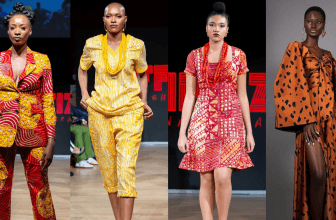
4. Yellow — Optimism and Creativity
Yellow brings joy and energy.
It’s associated with sunlight, hope, and innovation.
Designers often use yellow fabrics like cotton or organza to lift moods and draw attention in spring/summer collections.
![]() Psychology Tip: Bright yellow sparks creativity, while muted mustard tones create sophistication and warmth.
Psychology Tip: Bright yellow sparks creativity, while muted mustard tones create sophistication and warmth.
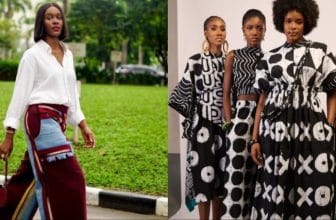
5. Black — Elegance and Mystery
Black isn’t just a color — it’s a statement.
It conveys authority, sophistication, and timeless beauty.
Designers use black fabrics like velvet, leather, or satin to symbolize power and mystery.
It’s also slimming, versatile, and the backbone of haute couture fashion.
![]() Psychology Tip: Black absorbs light, which gives it emotional depth and visual weight. That’s why it’s perfect for creating contrast.
Psychology Tip: Black absorbs light, which gives it emotional depth and visual weight. That’s why it’s perfect for creating contrast.
6. White — Purity and Minimalism
White represents purity, simplicity, and new beginnings.
Designers often choose white linen, lace, or silk to reflect clarity and peace.
From wedding dresses to minimalist streetwear, white evokes honesty and calm — but it can also be used as a blank canvas for creativity.
![]() Psychology Tip: White fabrics open space visually, making outfits feel lighter and more refined.
Psychology Tip: White fabrics open space visually, making outfits feel lighter and more refined.
7. Green — Growth and Balance
Green is the color of renewal. It connects fashion to nature, health, and prosperity.
Designers use green fabrics — cotton, linen, or satin — to represent calm confidence or eco-consciousness.
![]() Psychology Tip: Green balances emotion and helps people feel safe and refreshed — perfect for sustainable fashion branding.
Psychology Tip: Green balances emotion and helps people feel safe and refreshed — perfect for sustainable fashion branding.
8. Gold — Luxury and Success
Gold is the color of prestige and achievement.
It symbolizes success, royalty, and timeless wealth.
Designers incorporate gold-toned fabrics like lamé or silk brocade for red carpets, bridal wear, and statement fashion pieces.
![]() Psychology Tip: Metallic gold stimulates feelings of abundance and status — making any fabric instantly glamorous.
Psychology Tip: Metallic gold stimulates feelings of abundance and status — making any fabric instantly glamorous.
9. How Designers Combine Colors Emotionally
True color mastery comes from balance.
Designers combine warm and cool tones to control emotion — pairing passion (red) with calm (blue), or power (black) with purity (white).
This emotional harmony is what separates ordinary design from art.
![]() Pro Insight: Great designers don’t just match colors — they match feelings.
Pro Insight: Great designers don’t just match colors — they match feelings.
Closing Thoughts
Color psychology reminds us that fabrics don’t just cover the body — they express the soul.
Every shade tells a story, and every designer is a storyteller using the language of color.
At WeFabrics, we celebrate this creative relationship between color, emotion, and fabric. Because when you understand how color feels, you understand how to design beautifully.